Close
WE'RE ALL ABOUT
YOUR
SUCCESS
HOW WOULD YOU LIKE TO GET IN TOUCH:
Email
Email
Calendar
Cal
Close
WE'RE ALL ABOUT
YOUR
SUCCESS
HOW WOULD YOU LIKE TO GET IN TOUCH TO SCHEDULE YOUR DEMO:
Email
Email
Calendar
Cal
Mapline - mapping made powerful Close
Give us a call. We'd love to talk!

+1 800.969.1454

Close
Close
Geo Mapping Starter Close

Experience the power

Get ready to see your data in a whole new way!
magnifying glass with a checkmark inside

How-To Guide

CUSTOMIZE REPORTS

So, you’ve created a new report, but you need to know how to customize it? You’ve come to the right place.

Your reports are not just static documents; they’re a dynamic powerhouse that can be tailored to meet your specific needs. Whether you’re seeking a polished presentation or an in-depth analysis, our customization features empower you to shape your reports precisely the way you envision.

Let’s unlock the full potential of your reports and make them a true reflection of your data story. Here’s how!

DEFINE REPORT METRICS

The first step in drafting a compelling report is to decide which key metrics to highlight. Imagine you’re interested in assessing sales performance across different regions.

Here’s a breakdown of essential steps to guide you through the process:

Identify KPIs: Clearly outline the KPIs you want to report on.

Select Relevant Data: Choose the dataset columns that contain the information you need for your selected metrics.

Craft Your Narrative: Consider the story you want your report to tell. Are you looking to identify top-performing regions or product categories? Understanding the narrative helps you structure your report effectively.

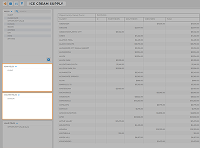
ROW AND COLUMN FIELDS

Row and column fields are the foundation of your report. Picture them as your data’s organizational framework–the building blocks that make up your data’s structure and give you clarity and context.

For example, if you’re assessing sales performance based on representatives and regions, placing “Rep Name” in the row field and “Region” in the column field allows for a clear and structured presentation of your data.
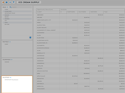
Screenshot of row and column fields in a mapline report

VALUE FIELDS

Value fields act as the storytellers of your data, breathing life into the numbers and revealing the true narrative. In our example, you’d use a value field to display the total sum of sales for each rep in each region.

This is where the numbers take center stage and provide a clear snapshot of performance.

This way, you can easily optimize sales strategies, identify top-performing team members, and allocate resources strategically.

Screenshot of value fields in a mapline report

CUSTOMIZE YOUR REPORT

Now comes the fun part – making the report uniquely yours:

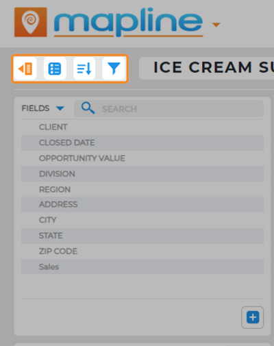
  • Collapse the Sidebar: Toggle this button to clear the stage and focus on what matters most.
  • Options Menu: This is your command center. You can share your report with others, embed it, view the raw data, change the data source, or even rename the report to something that resonates better.
  • Filter Data: Let’s say you want to focus on a specific region or a particular time frame. Use filters to narrow down the data displayed, providing a concentrated view of what matters most.
  • Sort Data: Organize your data like a pro. Sorting makes sure everything’s in order, so you can easily spot trends and insights.

And that’s it! Now you have the precise data you need, right at your fingertips.

Screenshot of a report customization menu in mapline