How-To Guide
Add a New Report
ADD NEW ITEMS
There are two primary ways to add a new report in Mapline:
- Visit your Reports Library and click the orange Add New Items button in the right hand sidebar.
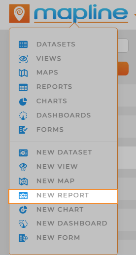
- Click the Mapline logo from anywhere in Mapline and select New Report from the dropdown menu.
NAME REPORT
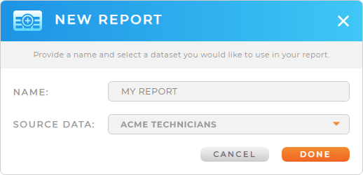
Name your report, then click the orange DONE button at the bottom-right of the Name Report window.
Your new report opens automatically, so you can start customizing it right away.
It’s a good idea to choose a name that reflects the purpose of your report. However, if you change your mind, you can always change the name later.
Pro Tip: Every new report auto-saves to the Reports Library, where you can access it any time.
REPORT FIELDS
All the columns in your dataset appear in this section of the report sidebar. To set up your report, drag the desired fields into the Row Fields, Column Fields, or Value Fields sections.

ROW FIELDS
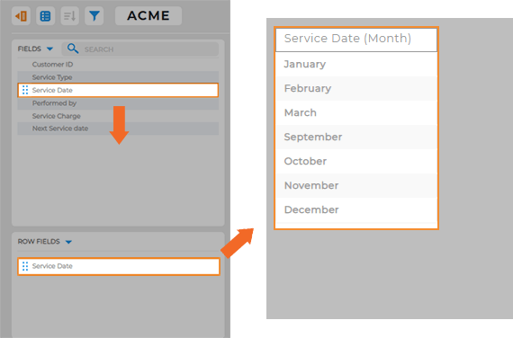
This is where you customize the rows for your report. For example, perhaps you want your rows to list out the months of the year. In this example, we’ll drag the Month column from the Report Fields section to the Row Fields section.
Bam! Now you’ve got every month of the year listed out in your report.
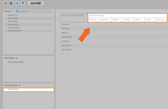
COLUMN FIELDS
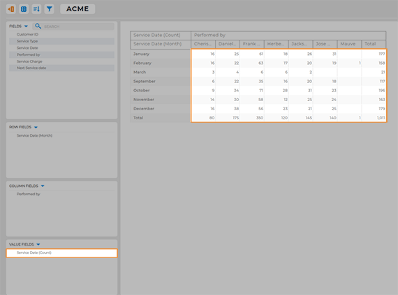
Here, determine the fields you want to visualize as columns. In this example, we want to see our technician’s monthly stats. So, we’ll drag the Performed By field to the Column Fields section in the report sidebar. (In this case, that is the name of the column that lists technician names).
Now, we have all of our technician names listed out as columns. How easy was that?
VALUE FIELDS
Now, you’ll determine which values you want to display in the report cells. For example, to display how many service visits each technician performs per month, we’ll drag the Service Date field from the Report Fields section to the Value Fields section.
There you go! Now every cell in the report displays how many visits each technician completed for every month of the year. That’s pretty sweet!