How-To Guide
Customize Charts
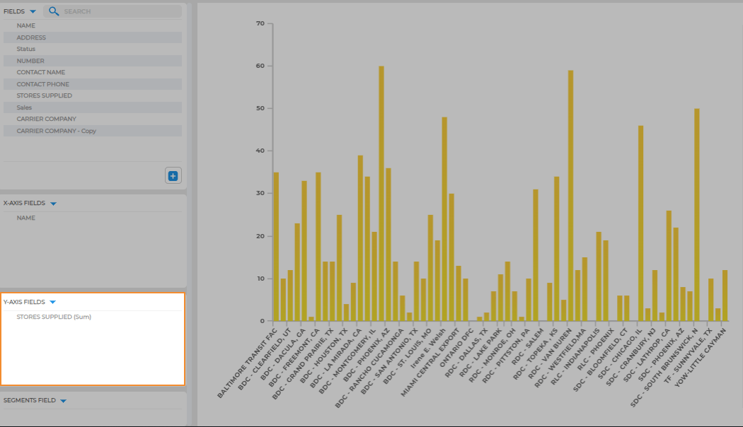
X AND Y AXIS
Think of the x-axis as your chart’s horizontal guide. It works best for quantitative data like names and zip codes.
For instance, you could list your distribution centers here to see how many stores each one supplies.
The y-axis, on the other hand, is the vertical line that deals with numbers. It’s perfect for showcasing sums or counts of data. For example, you might want to display the sum of stores supplied by each distribution center.
Click and drag the dataset column you want to see down to the x-axis of your chart.
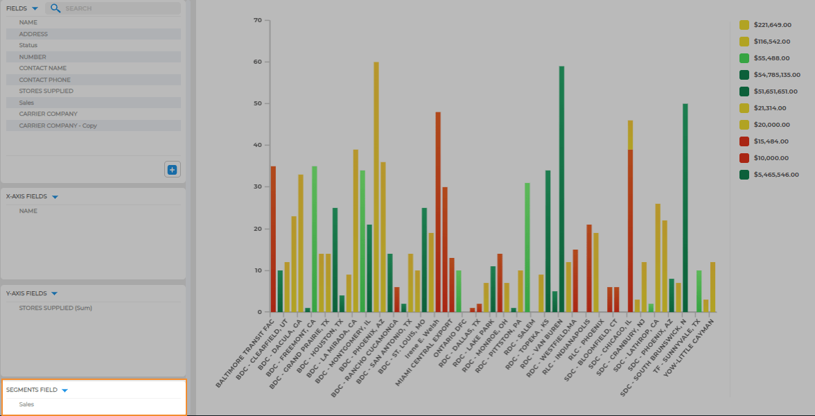
SEGMENT FOR MORE INSIGHTS
Segments are not required on your chart. However, they can be incredibly useful when you want to drill down and reveal more insights.
For instance, if you segment your chart by sales, you can quickly figure out how high and low-performing stores tie back to each distribution center. It’s a neat trick to understand the connection between performance and sales.
MAKE IT YOUR OWN
Now that your chart is loaded with the right data, let’s add your personal touch:
- Expand/Collapse Sidebar: Toggle this button to show or hide your chart’s sidebar. Great for focusing on essential info or going full-screen.
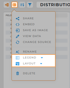
- Options Menu: Here, you’ll find some general options like sharing and embedding, plus a few chart-specific tricks:
- Legend: Choose to show your legend on the left, right, or hide it.
- Layout: Switch between a vertical or horizontal bar chart.
- Customize Chart Legend: Right-click the legend to change colors or adjust font style.
That’s it! Now, your chart is custom-tailored to fit your needs. No frills, just quick and easy customization to make your data work for you.