How-To Guide
Add a New Chart
ADD NEW ITEMS
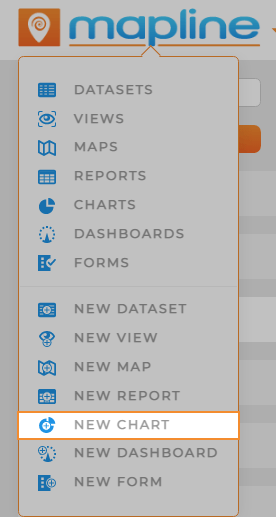
Here are two primary ways to add a new chart in Mapline:
- Visit your Charts Library and click the orange Add New Items button in the righthand sidebar.
- Click the Mapline logo from anywhere in Mapline and select New Chart from the dropdown menu.
NAME CHART
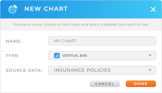
Name your chart, then click the orange DONE button at the bottom-right of the Name Report window.
Your new chart opens automatically, so you can start customizing it right away.
It’s a good idea to choose a name that reflects the purpose of your chart. However, if you change your mind, you can always change the name later.
Pro Tip: Every new chart auto-saves to the Charts Library, where you can access it any time.
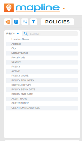
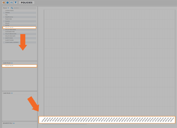
CHART FIELDS
All of your dataset columns appear in this section of the chart sidebar. To set up your chart, drag the desired fields into the X-Axis, Y-Axis, or Segments sections.
X-AXIS FIELDS
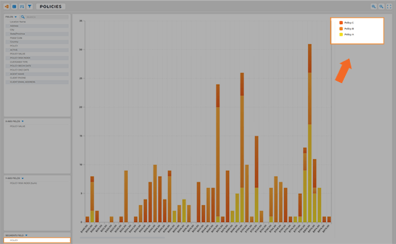
This is where you customize the X-Axis of your chart. Say we want our X-Axis to show insurance policy values. In this example, we’ll drag the Policy Value column from the Chart Fields section to the X-Axis Fields section.
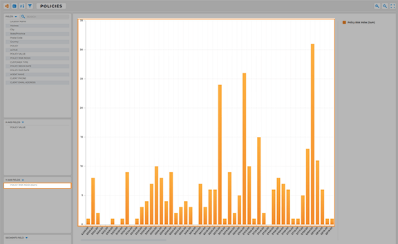
Bam! You’ve got every policy value listed in the X-Axis of your chart.
Y-Axis Fields
Here, determine the fields you want represented in the Y-Axis. In this example, we want to see the customer’s risk index compared to policy value. So, we’ll drag the Policy Risk Index field to the Y-Axis section in the sidebar.
Now, we can see the risk index of each policy, segmented out by policy value. How easy was that?
SEGMENTS FIELDS
Now, you’ll determine whether to further segment your data by sub-category. For example, to break up our chart by policy type, we’ll drag the Policy field to the Segments Field section.
There you go! Now every policy value in the chart is broken out into different colors representing the 3 different policy types from our source dataset. That’s pretty sweet!